This handbook is not intended for the researcher who wishes to publish original research in the professional journals; that requires too much attention to detail for the introductory statistics student. This section will present an overall structure which may be useful to the student in presenting quantitative information to others. An attempt will be made to be compatible with the style required in professional journals, theses, or dissertations. This chapter, however, will not be adequate for such a presentation. The interested reader may find the details of such a writing style in the APA Publication Manual (1974).
Most research papers in psychology contain four major sections: Introduction, Methods, Results, and Discussion. Each major section begins on a new page, and except for the introduction, is titled by centering and capitalizing all letters in the heading.
The introduction provides the reader with a general frame of reference and structure for the rest of the paper. The first paragraph should introduce the central theme and state why you think it is important to study the topic. Following this, any past research should be cited which is relevant to the present study. Results of cited studies should be summarized and the relationship to the present study should be described. APA style references are preferred, but others are acceptable. The important thing is that you document your work. Why is this interesting to you? Why is it interesting to the reader? What decisions will benefit from collecting and analyzing the information? The introduction generally runs two to four pages. Any longer and you are including unnecessary detail.
While the introduction is not the major focus of the student project, a good introduction can greatly enhance the results and discussion section. A good introduction has a certain flow to it. By the end of the introduction the reader should not be surprised by the variables that were collected or the hypotheses that were made.
The next paragraphs elaborate on the central theme. That is, they describe the manner in which you approached the problem. Is your project an extension of previous studies? If so, how is it similar? different? If not, what kind of variables have you selected in relation to the central theme. In either case the reason why the particular variables were selected should be explained to the reader.
If any hypotheses concerning the outcome of the study are being made they should occur in the introduction. That is, if an outcome will be interpreted as support of a theory or hypothesis about the world, that should be reported. If there are any predictions from the theory about how the study will turn out, they should be told to the reader in advance and their derivation explained.
In a correctly performed study, the introduction, or at least an outline of the introduction, will be written before the data are collected and will be included in the project proposal. This insures that some thought has been put into the project before the data collection is begun, besides making the final project much easier to write.
The methods section documents how you collected your data and is generally composed of a number of subsections, including: Records, Apparatus, Procedure, and Hypotheses. Each subsection is labeled as such by left-justifying the title and underlining it. A well-written methods section allows the reader to duplicate the study or compare it to other studies. If using pre-existing data, the methods section is still necessary and in addition, a link to the source is needed.
Records - Even though subjects or participants is the traditional expression in psychological literature, records is a better description. If one is observing cereal boxes or automobiles it hardly seems right to call them participants, although if you are surveying people, you may use participants if you like. The records subsection usually appears first in the methods section. It describes both the population of interest and the subset of that population from which data were collected. The method that was used to select the sample should be described as well as characteristics of the sample, such as number, sex, and location. For this project, it is not necessary to select a random sample, although the sampling procedure should be specified and the effect of the particular sampling procedure used discussed in the discussion section.
Stimuli and Apparatus - This subsection includes a description of the physical apparatus which was used to measure the variables in the study. These may include such things as meter sticks, scales, timers, psychological tests, questionnaires, etc. If possible, brand or trade names should be used, and in the case of tests and other survey type instruments borrowed from previous studies, appropriate literature citations should be given to indicate their source. An example data collection sheet or questionnaire should appear in an appendix as in "The survey used to collect the data appears in Appendix A".
Procedure - The procedure subsection describes the way the apparatus, described in the preceding subsection, was used to collect the data. The description should be detailed enough so that another researcher could carry out a study equivalent to yours. Included in this subsection are instructions to the subjects, perhaps not in exact detail, but summarized with the important points highlighted. Also included is the order and procedure for collecting data. For instance, if a questionnaire was utilized, did the researcher fill it in or did the participant? Was the participant anonymous? How long did it take? Was all the information collected at one time, or were several different time periods used? How were individuals approached and asked to participate? How many refused?
Three general rules for organizing the results section are:
(1) The basic results are presented before complex results.
(2) The results of the study are usually presented in order of decreasing importance with the most important results presented first.
(3) If a result either confirms or disconfirms an hypothesis that was made in the introduction, it must be included in the results section.
Every data set has at least one story to tell. In doing the project, your job is to analyze the data to first find the story you want to tell and then to tell it to the reader in a clear and concise manner. In most cases tables and figures will be most useful to convey the story to the reader. The text of the results section should serve to highlight important features of the tables and figures and direct the reader's attention to the most interesting findings, but should not duplicate the information presented by these methods. A number of methods of presenting the results are appropriate depending upon the type of data collected and the kinds of questions asked. In general, no one study will utilize all the following methods, but most will use more than one.
When faced with a mass of computer output and the requirement that it be condensed, organized, and analyzed, the student is faced with a difficult task. A few tricks of the trade reduce the magnitude of the problem. The significance level or probability value of an analysis allows the reader to make a decision as to whether or not it is worth his or her time to interpret the results. Basically, if the significance level is .05 or greater, then the results are non-significant and could have occurred by chance. In that case any interpretation is subject to question in that chance could have explained the results. In general, then, the researcher will place faith in those analyses that have a significance level of less than .05. This does not mean that results which are non-significant should not be presented in the report, only that interpretation of relationships which are not significant should not be given a great deal of credibility. In general, then the first step in an analysis is to page through and mark any significant results. Some will be unimportant, for example, a significant relationship between age and class rank is of little interest. The others, however, will form the core of the report.
In some cases the researcher is interested in the results of a single variable, for example, the proportion of students who are satisfied with the service they receive at the university health clinic, or the average number of minutes students would be willing to walk to class if they had to pay $4.00 to park. The presentation of the data in the project will depend upon the level of measurement of the variable and the quality and quantity of the data. Ordinal data will not be discussed because information of this type is seldom collected for student projects.
When the measurement level is clearly nominal and contains less than eight levels, then the preferred method of presentation is either tabular or graphic, using a bar graph or pie chart. One successful tabular approach is to write the proportion or percentage of responses for each level on an example questionnaire. If eight or more levels have been used for a single variable, then the RECODE command is appropriate to reduce the number of levels to less than eight.
In this case a table of means and standard deviations is most often used. They can be most easily obtained from the DESCRIPTIVES command. Where the distribution of a particular variable is critical to the study, a frequency polygon or histogram is often used.
In some cases it is not at all clear whether the variables are measured on a nominal, ordinal, interval, or ratio level. Some question exists, for example, when there are fewer than eight response categories, such as in scales with the following five categories:
strongly agree agree no opinion disagree strongly disagree.
In these cases either tables of proportions of responses or tables of means and standard deviations may be used, depending upon the discretion of the writer. In some cases both methods may be used. The method of choice is the one which the researcher believes most simply and accurately presents the data. Keep the reader in mind. SPSS variable names may mean something to you, but next to nothing to the reader. Successful tables basically duplicate the items on the survey, but include results. The tables generated in SPSS output are not formatted to be either clear or concise. In a good project, it is necessary to reformat the information in a different manner. In other words, do not directly cut-and-paste SPSS output into your project. The next table presents an example of organizing the results around the survey.
| Mean | s.d. | ||||||
| 18.78 | 2.37 | Age | |||||
| Males | Females | Mean | s.d. | ||||
| 50% | 50% | .50 | .51 | Gender | |||
| Freshman | Sophomore | Junior | Senior | Other | Mean | s.d. | |
| 10% | 20% | 30% | 25% | 15% | 3.15 | 1.23 | Rank |
| Family | Personal | Scholarships | Other | ||||
| 15.8% | 31.6% | 36.8% | 15.8% | Support | |||
| Strong Disagree | Disagree | No Opinion | Agree | Strong Agree | Mean | s.d. | |
| 25% | 30% | 30% | 5% | 10% | 2.45 | 1.23 | Student Role of Apprentice |
| 35% | 25% | 30% | 10% | 0% | 2.15 | 1.04 | Student Role of Ward |
| 0% | 35% | 40% | 25% | 0% | 2.90 | .79 | Student Role of Client |
| None | Membership | Voting | Equal | Total | Mean | s.d. | |
| 20% | 30% | 45% | 5% | 2.40 | .99 | Curriculum | |
| 45% | 25% | 5% | 15% | 5% | 2.05 | 1.31 | Faculty |
| 15% | 15% | 20% | 30% | 20% | 3.25 | 1.37 | Budget |
If one the results presented in the above table was particularly interesting or relevant, it would be appropriate to present it graphically in addition to in a table. Graphs tend to grab the reader's attention much better than numbers in a table and should be used where appropriate. Too many graphs can be distracting, however. Again, the goal is to first find the story in the data and then find the best way to tell it to the reader. Like a good introduction, a good results section has a certain flow to it.
A related difficulty occurs when the data are dichotomous. In this case, however, either method of presentation, proportions in each category or means and standard deviations presents the reader with identical information. I always code dichotomous variables with 0's and 1's, for example "no" = 0 and "yes" = 1. That way, when I find means it is the proportion of "yes" responses.
The presentation of results dealing with relationships between variables present many of the same difficulties as presenting results from single variables. Because combinations of variable types must be considered, the number of possible alternatives are increased.
In this case a contingency table is clearly the most appropriate analysis. In all cases the percentages and totals of the cells, rows, and columns should be given, along with the chi-square value. Depending upon their importance, conditional cell percentages may also be presented to the reader. The contingency table presented in the following table is taken from the analysis of two nominal variables from the example data matrix. The table is an example of two contingency tables output from the SPSS statistical computer package using the CROSSTABS command.
| Rank | |||||
| Freshman | Sophomore | Junior | Senior | Other | |
| 20% | 10% | 20% | 30% | 20% | Male |
| 0% | 30% | 40% | 20% | 10% | Female |
| Support | |||||
| Personal | Family | Scholarships | Other | ||
| 10% | 30% | 40% | 10% | Male | |
| 20% | 39% | 30% | 20% | Female |
Contingency tables can be difficult to read and when they have lots of cells they can be almost impossible to read. They should be used sparingly in your project.
In this case means and standard deviations of the interval or ratio data can be calculated for each category or level of the nominal variable. In many cases a number of separate analyses may be combined into a single table by cutting and pasting the results of a number of simple tables into a single table. The following table is a presentation of the relationship between an analysis of two nominal variables and four interval variables. As can be seen from this table, a great deal of information may be presented in a simple manner utilizing this type of presentation. As in the case of the individual variables, it is often appropriate to use the actual items on the survey (or summaries of them) in the table, rather than SPSS variable names. Note that the table present below combines the output of numerous SPSS output tables into a single table.
| Male | Female | Sig. | |
| 18.6 | 19.0 | .733 | Age |
| 3.2 | 3.1 | .861 | Rank |
| 2.3 | 2.6 | .600 | Student Role of Apprentice |
| 2.1 | 2.2 | .836 | Student Role of Ward |
| 2.9 | 2.9 | 1.000 | Student Role of Client |
| 2.2 | 2.6 | .383 | Curriculum |
| 2.33 | 1.8 | .391 | Faculty |
| 3.0 | 3.5 | .430 | Budget |
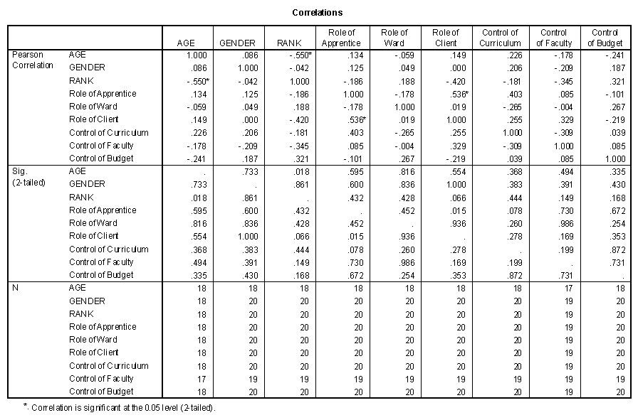
The appropriate summary statistic in this case is the correlation coefficient and the most convenient presentation is the correlation matrix. In the correlation matrix, all possible correlations between variables are presented as entries in a table with rows and columns consisting of the names of the variables. Only one-half of the matrix must be given because the entries are symmetric, that is, the correlation between SLEEP and STUDY is the same as the correlation between STUDY and SLEEP. As noted before, dichotomous nominal variables may be considered to be interval measures and correlations with other variables presented in the correlation matrix. In general, correlation matrices are useful in discovering the story of the data, but much less useful in presenting the information to the reader. If I encounter a correlation matrix early in a results section, my mind generally shuts down. Even later in the results section a large correlation matrix is easy to ignore.
Roles correlation matrix
A scatterplot is a much more easily cognitively processed presentation of the detailed relationship between two interval or ratio variables. Because some relationships are more critical to the central hypothesis than others, especially if they are unexpectedly high or low, they should be shown in scatterplots. Again, too many graphs can be distracting, but used sparingly, they are the best way to present your story.
The three basic methods of presenting relationships given above are not limited to only the scale types that were presented. In some cases it may be useful to break down interval or ratio variables by levels of another interval or ratio variable. It is possible to treat interval or ratio data as nominal, but not vice-versa. In other words, scale types are only a general guideline to type of preferred analysis. Type of presentation of results depends largely on the type and amount of information the writer wishes to convey to the reader. My suggestion is to try different methods and select the one that works the best in your project. It is easy to create a poor 30 page project by cutting and pasting random SPSS output. It is harder to write a 10 page project that tells a story in a coherent manner.
The purpose of the discussion section is to summarize, discuss, and conclude the paper. The discussion section allows the researcher to present ideas, impressions, and possible artifacts related to the research project. The writer is not limited to facts, as in the results section, but is allowed to discuss the implications of the research.
The first paragraph of the discussion section usually summarizes the important results without recourse to numbers, figures, or tables. The content of the rest of this section is generally variable, but the following presents some possible areas which might be discussed. Some readers with a minimal understanding of statistics start by reading the discussion section.
One such area is whether or not the hypotheses and predictions made in the introduction were upheld. Now that more information is known about the area, what conclusions have you reached? How have your ideas and opinions been changed in light of the evidence? The readers will have probably drawn their own conclusions, but will be interested to see if your conclusions agree with their own. This part of the project should not be taken lightly because the end goal of statistical usage is to make rational conclusions and decisions. The conclusions of a good scientist are based on the evidence collected and the inductive power of the statistical method.
A second area which is sometimes included in the discussion section is an acknowledgement of factors which might have affected the study. These factors include such things as sampling method, measurement instruments, and procedure. If any of these factors were changed, how do you think they would have affected the results? If you had to do the study over again, how would you do it differently? If you have to be critical of your project, here is the place to do it. Once in a while a student will start out in the introduction by saying "This is the worst piece of trash I have ever written." Who wants to continue reading such a paper? If you must say it, say it in the discussion.
A third area is that of implications. Some useful questions in this area are: What implications exist for further research? What kind of changes in policy decisions of either your own life or that of society would you make on the basis of your results? A strong concluding statement will let the reader know both where you stand and that the paper is finished.
Knowing about statistics is different than applying them to a real world situation. Following the successive stages to the completion of the project, even if little worthwhile information is obtained, may deepen the appreciation of the statistical tools available for knowing about the world.