As discussed earlier, there are two major means of summarizing a set of numbers: pictures and summary numbers. Each method has advantages and disadvantages and use of one method need not exclude the use of the other. This chapter describes drawing pictures of data, which are called frequency distributions.
The first step in drawing a frequency distribution is to construct a frequency table. A frequency table is a way of organizing the data by listing every possible score (including those not actually obtained in the sample) as a column of numbers and the frequency of occurrence of each score as another. Computing the frequency of a score is simply a matter of counting the number of times that score appears in the set of data. It is necessary to include scores with zero frequency in order to draw the frequency polygons correctly.
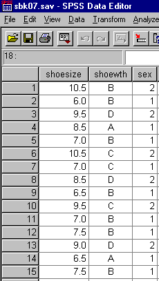
For example, consider the following set of 15 scores which were obtained by asking a class of students their shoe size, shoe width, and sex (male or female).
Example Data
| Shoe Size | Shoe Width | Gender |
|---|---|---|
| 10.5 | B | M |
| 6.0 | B | F |
| 9.5 | D | M |
| 8.5 | A | F |
| 7.0 | B | F |
| 10.5 | C | M |
| 7.0 | C | F |
| 8.5 | D | M |
| 6.5 | B | F |
| 9.5 | C | M |
| 7.0 | B | F |
| 7.5 | B | F |
| 9.0 | D | M |
| 6.5 | A | F |
| 7.5 | B | F |
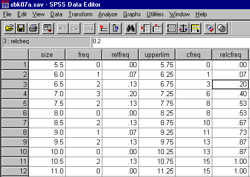
The same data entered into a data file in SPSS appears as follows:
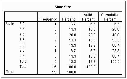
To construct a frequency table, start with the smallest shoe size and list all shoe sizes as a column of numbers. The frequency of occurrence of that shoe size is written to the right.
Frequency table of Example Data
| Shoe Size | Absolute Frequency |
|---|---|
| 6.0 | 1 |
| 6.5 | 2 |
| 7.0 | 3 |
| 7.5 | 2 |
| 8.0 | 0 |
| 8.5 | 2 |
| 9.0 | 1 |
| 9.5 | 2 |
| 10.0 | 0 |
| 10.5 | 2 |
| 15 |
Note that the sum of the column of frequencies is equal to the number of scores or size of the sample (N = 15). This is a necessary, but not sufficient, property in order to insure that the frequency table has been correctly calculated. It is not sufficient because two errors could have been made, canceling each other out.
While people think of their shoe size as a discrete unit, a shoe size is actually an interval of sizes. A given shoe size may be considered the midpoint of the interval. The real limits of the interval, the two points which function as cut-off points for a given shoe size, are the midpoints between the given shoe sizes. For example, a shoe size of 8.0 is really an interval of shoe sizes ranging from 7.75 to 8.25. The smaller value is called the lower real limit, while the larger is called the upper real limit. In each case, the limit is found by taking the midpoint between the nearest score values. For example, the lower limit of 7.75 was found as the average (midpoint) of 7.5 and 8.0 by adding the values together and dividing by two (7.5 + 8.0) / 2 = 15.5/2 = 7.75. A similar operation was performed to find the upper real limit of 8.25, that is, the midpoint of 8.0 and 8.5.
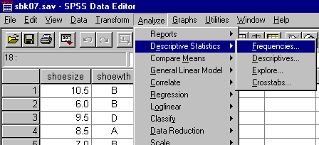
To generate a frequency table using the SPSS package, select Analyze/Descriptive Statistics/Frequencies as illustrated below:
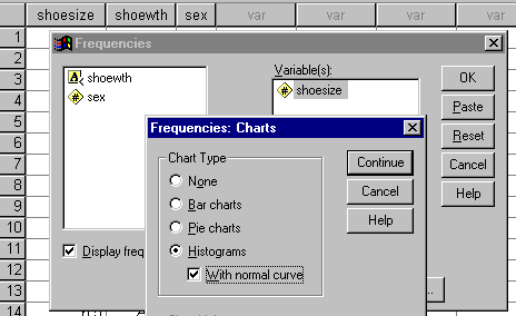
In the frequencies box, select the variable name used for shoe size and the following choices:
The listing of the results of the analysis should contain the following:
The information contained in the frequency table may be transformed to a graphical or pictorial form. No information is gained or lost in this transformation, but the human information processing system often finds the graphical or pictorial presentation easier to comprehend. There are two major means of drawing a graph, histograms and frequency polygons. The choice of method is often a matter of convention, although there are times when one or the other is clearly the appropriate choice.
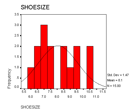
A histogram is a graph drawn by plotting the scores (midpoints) on the X-axis and the frequencies on the Y-axis. A bar is drawn for each score value, the width of the bar corresponding to the real limits of the interval and the height corresponding to the frequency of the occurrence of the score value. An example histogram is presented below for the book example. Note that although there were no individuals in the example with shoe sizes of 8.0 or 10.0, those values are still included on the X-axis, with the bar for these values having no height.
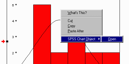
The figure above was drawn using the SPSS computer package. Included in the output from the frequencies command described above was a histogram of shoe size. Unfortunately, the program must be edited in order to generate a figure like the one above. To edit a figure in the listing file, place the cursor (arrow) on the figure and hit the right mouse button. When a menu appears, select the last entry on the list as follows:
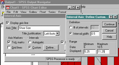
Edit the graph selecting the following options:
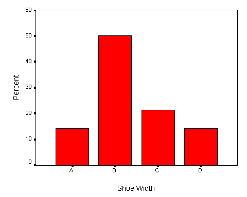
If the data are nominal categorical in nature, the graph is similar, except that the bars do not touch. In this case the graph is called a bar graph. The example below presents the data for shoe width, assuming that it is not interval in nature. The example was drawn using the example SPSS data file and the Bar Graph command.
When the data are nominal-categorical in form, the bar graph is the only appropriate form for the picture of the data. When the data may be assumed to be interval, then the histogram can sometimes have a large number of lines, called data ink, which make the comprehension of the graph difficult. A frequency polygon is often preferred in these cases because much less ink is needed to present the same amount of information.
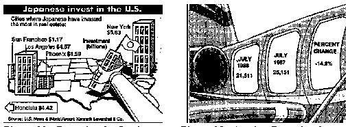
In some instances artists attempt to "enhance" a histogram by adding extraneous non data ink. Two examples of this sort of excess were taken from the local newspaper. In the first, the arm and building add no information to the illustration. San Francisco is practically hidden, and no building is presented for Honolulu. In the second, the later date is presented spatially before the earlier date and the size of the "bar" or window in this case has no relationship to the number being portrayed. These types of renderings should be avoided at all costs by anyone who in the slightest stretch of imagination might call themselves "statistically sophisticated." An excellent source of information about the visual display of quantitative information is presented in Tufte (1983)
The Visual Display of Quantitative Information
096139210X
$40
Tufte (1983)
1983
Edward R.Tufte
Cheshire, Conn
Graphics Press
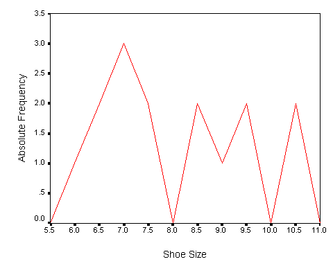
An absolute frequency polygon is drawn exactly like a histogram except that points are drawn rather than bars. The X-axis begins with the midpoint of the interval immediately lower than the lowest interval, and ends with the interval immediately higher than the highest interval. In the example, this would mean that the score values of 5.5 and 11.0 would appear on the X-axis. The frequency polygon is drawn by plotting a point on the graph at the intersection of the midpoint of the interval and the height of the frequency. When the points are plotted, the dots are connected with lines, resulting in a frequency polygon. An absolute frequency polygon of the data in the book example is presented below.
Note that when the frequency for a score is zero, as is the case for the shoe sizes of 8.0 and 10.0, the line goes down to the X-axis. Failing to go down to the X-axis when the frequency is zero is the most common error students make in drawing non-cumulative frequency polygons.
The absolute frequency polygon drawn above used an indirect method in SPSS. A new data set was constructed from the frequency table as follows:
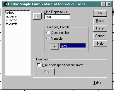
The graph was drawn by selecting Graphs/Line Charts as follows and then selecting Simple, checking the option Values of individual cases, and clicking Define on the next screen:
The next screen selects the columns to use in the display. All the following graphs will be created in a similar manner by selecting different variables as rows and columns.
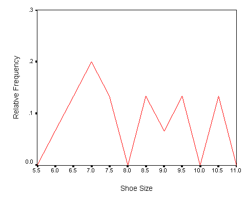
In order to draw a relative frequency polygon, the relative frequency of each score interval must first be calculated and placed in the appropriate column in the frequency table.
The relative frequency of a score is another name for the proportion of scores that have a particular value. The relative frequency is computed by dividing the frequency of a score by the number of scores (N). The additional column of relative frequencies is presented below for the data in the book example.
Frequency table of Example Data
| Shoe Size | Absolute Frequency | Relative Frequency |
|---|---|---|
| 6.0 | 1 | .07 |
| 6.5 | 2 | .13 |
| 7.0 | 3 | .20 |
| 7.5 | 2 | .13 |
| 8.0 | 0 | .00 |
| 8.5 | 2 | .13 |
| 9.0 | 1 | .07 |
| 9.5 | 2 | .13 |
| 10.0 | 0 | .00 |
| 10.5 | 2 | .13 |
| 15 | .99 |
The relative frequency polygon is drawn exactly like the absolute frequency polygon except the Y-axis is labeled and incremented with relative frequency rather than absolute frequency. The frequency distribution pictured below is a relative frequency polygon. Note that it appears almost identical to the absolute frequency polygon.
A relative frequency may be transformed into an absolute frequency by using an opposite transformation; that is, multiplying by the number of scores (N). For this reason the size of the sample on which the relative frequency is based is usually presented somewhere on the graph. Generally speaking, relative frequency is more useful than absolute frequency, because the size of the sample has been taken into account.
An absolute cumulative frequency is the number of scores which fall at or below a given score value. It is computed by adding up the number of scores which are equal to or less than a given score value. The cumulative frequency may be found from the absolute frequency by either adding up the absolute frequencies of all scores smaller than or equal to the score of interest, or by adding the absolute frequency of a score value to the cumulative frequency of the score value immediately below it. The following is presented in tabular form.
| Shoe Size | Absolute Frequency | Absolute Cumulative Freq |
|---|---|---|
| 6.0 | 1 | 1 |
| 6.5 | 2 | 3 |
| 7.0 | 3 | 6 |
| 7.5 | 2 | 8 |
| 8.0 | 0 | 8 |
| 8.5 | 2 | 10 |
| 9.0 | 1 | 11 |
| 9.5 | 2 | 13 |
| 10.0 | 0 | 13 |
| 10.5 | 2 | 15 |
| 15 |
Note that the cumulative frequency of the largest score (10.5) is equal to the number of scores (N = 15). This will always be the case if the cumulative frequency is computed correctly. The computation of the cumulative frequency for the score value of 7.5 could be done by either adding up the absolute frequencies for the scores of 7.5, 7.0, 6.5, and 6.0, respectively 2 + 3 + 2 + 1 = 8, or adding the absolute frequency of 7.5, which is 2, to the absolute cumulative frequency of 7.0, which is 6, to get a value of 8.
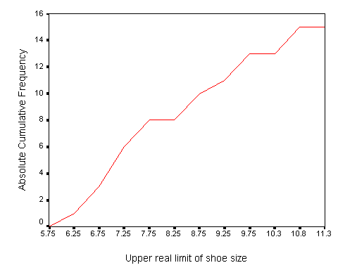
Plotting scores on the X-axis and the absolute cumulative frequency on the Y-axis draws the cumulative frequency polygon. The points are plotted at the intersection of the upper real limit of the interval and the absolute cumulative frequency. The upper real limit is used in all cumulative frequency polygons because of the assumption that not all of the scores in an interval are accounted for until the upper real limit is reached. The book example of an absolute cumulative frequency polygon is presented below.
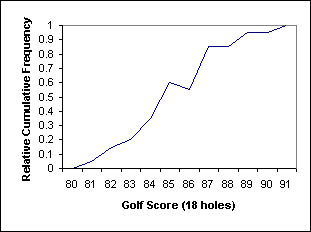
A cumulative frequency polygon will always be monotonically increasing, a mathematicians way of saying that the line will never go down, but that it will either stay at the same level or increase. The line will be horizontal when the absolute frequency of the score is zero, as is the case for the score value of 8.0 in the book example. When the highest score is reached, i.e. at 10.5, the line continues horizontally forever from that point. The cumulative frequency polygon, while displaying exactly the same amount of information as the absolute frequency distribution, expresses the information as a rate of change. The steeper the slope of the cumulative frequency polygon, the greater the rate of change. The slope of the example cumulative polygon is steepest between the values of 6.75 and 7.25, indicating the greatest number of scores between those values.
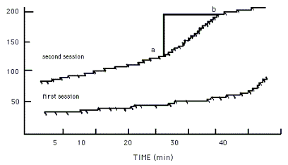
Rate of change information may be easier to comprehend if the score values involve a measure of time. The graphs of rate of rat bar pressing drawn by the behavioral psychologist are absolute cumulative polygons, as shown below.
An absolute relative cumulative frequency is the proportion of scores which fall at or below a given score value. It is computed by dividing the absolute cumulative frequency by the number of scores (N). The result is the proportion of scores that fall at or below a given score. The relative cumulative frequency becomes:
| Shoe Size | Abs Freq | Abs Cumulative Freq | Rel Cumulative Freq |
|---|---|---|---|
| 6.0 | 1 | 1 | .06 |
| 6.5 | 2 | 3 | .20 |
| 7.0 | 3 | 6 | .40 |
| 7.5 | 2 | 8 | .53 |
| 8.0 | 0 | 8 | .53 |
| 8.5 | 2 | 10 | .67 |
| 9.0 | 1 | 11 | .73 |
| 9.5 | 2 | 13 | .87 |
| 10.0 | 0 | 13 | .87 |
| 10.5 | 2 | 15 | 1.00 |
| 15 |
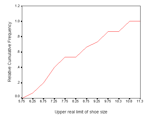
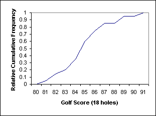
Drawing the X-axis as before and the relative cumulative frequency on the Y-axis draws the relative cumulative frequency polygon directly from the preceding table. Points are plotted at the intersection of the upper real limit and the relative cumulative frequency. The graph that results from the book example is presented below.
Note that the absolute and relative cumulative frequency polygons are identical except for the Y-axis. Note also that the value of 1.000 is the largest relative cumulative frequency, and the highest point on the polygon.