An investigator interested in finger-tapping behavior conducts the following study: Students are asked to tap as fast as they can with their ring finger. The hand is cupped and all fingers except the one being tapped are placed on the surface. Either the right or the left hand is used, at the preference of the student. At the end of 15 seconds, the number of taps for each student is recorded. Example data using 18 subjects are presented below:
| 53 | 35 | 67 | 48 | 63 | 42 | 48 | 55 | 33 | 50 | 46 | 45 | 59 | 40 | 47 | 51 | 66 | 53 |
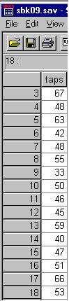
A data file in SPSS corresponding to the example data is presented below:
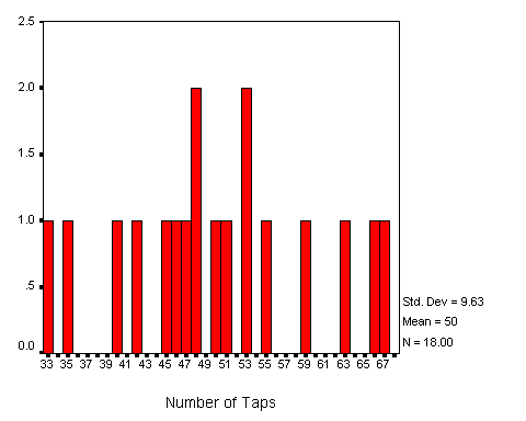
The frequency table resulting from this data would have 34 different score values, computed by subtracting the low score (33) from the high score (67). A portion of this table is presented below:
| # Taps | Absolute Frequency |
|---|---|
| 33 | 1 |
| 34 | 0 |
| 35 | 1 |
| ... | ... |
| 65 | 0 |
| 66 | 1 |
| 67 | 1 |
| 18 |
A histogram drawn using this data would appear as follows:
The above table and graph present all the information possible given the data. The problem is that so much information is presented that it is difficult to discern what the data is really like, or to "cognitively digest" the data. The graph is given the term "saw-toothed" because the many ups and downs give it the appearance of teeth on a saw. The great amount of data ink relative to the amount of information on the polygon makes an alternative approach desirable. It is possible to lose information (precision) about the data to gain understanding about distributions. This is the function of grouping data into intervals and drawing grouped frequency polygons.
The process of drawing grouped frequency distributions can be broken down into a number of interrelated steps: selecting the interval size, computing the frequency table, and drawing the grouped frequency histogram or polygon. Each will now be discussed in turn.
The goal in selecting an interval size is to present as much information to the reader as possible in the simplest form possible. In some cases, as illustrated in the example above, the graph contains too much information to be easily readable. In grouping the data into intervals, the statistician reduces the information in the graph in order to make it easier to understand. There is a tradeoff, then, between the amount of information in the graph and the difficulty in reading the graph. The statistician desires to select the point where the graph containing the greatest amount of information is presented in a readable form. This point may be different depending upon the reader.
Selecting the interval size is more art than science. The statistician has to start at some point, so the following procedure is fairly standard. In order to find a starting interval size the first step is to find the range of the data by subtracting the smallest score from the largest. In the case of the example data, the range was 67-33 = 34. The range is then divided by the number of desired intervals, with a suggested starting number of intervals being ten (10). In the example, the result would be 34/10 = 3.4. The nearest odd integer value is used as the starting point for the selection of the interval size. In the example the nearest odd integer would be 3.
After the interval size has been selected, the scale is then grouped into equal-sized intervals based on the interval size. The first interval will begin with a multiple of the interval size equal to, or smaller than, the smallest score. In the example the first interval would begin with the value of 33, a multiple of the interval size (3 * 11). In this case the beginning of the first interval equals the smallest score value.
The ending value of the first interval is computed by adding the interval size to the beginning of the first interval and subtracting the unit of measurement. In the example, the beginning of the first interval (33) plus the interval size (3) minus the unit of measurement (1) results in a value of 33 + 3 -1 or 35. Thus the first interval would be 33 to 35. Sequentially adding the interval size to these values results in all other intervals, for example 36 to 38, 39 to 41, etc.
The values for the intervals just constructed are called the apparent limits of the intervals. In the first interval, for example, the value of 33 would be called the apparent lower limit, and the value of 35 would be the apparent upper limit.
The midpoints of the intervals are computed by adding the two apparent limits together and dividing by two. The midpoint for the interval 33 to35 would thus be (33 + 35)/2 or 34. The midpoint for the second interval (36-38) would be 37.
The midpoints between midpoints are called real limits. Each interval has a real lower limit and a real upper limit. The interval 36-38 would therefore have a real lower limit of 35.5 and a real upper limit of 38.5. Please note that the difference between the real limits of an interval is equal to the interval size, that is 38.5 - 35.5 = 3. All this is easier than it first appears, as can be seen in the following grouping:
| Apparent | Real | ||||
|---|---|---|---|---|---|
| Interval | Lower Limit | Upper Limit | Lower Limit | Upper Limit | Midpoint |
| 33-35 | 33 | 35 | 32.5 | 35.5 | 34 |
| 36-38 | 36 | 38 | 35.5 | 38.5 | 37 |
| 39-41 | 39 | 41 | 38.5 | 41.5 | 40 |
| 42-44 | 42 | 44 | 41.5 | 44.5 | 43 |
| 45-47 | 45 | 47 | 44.5 | 47.5 | 46 |
| 48-50 | 48 | 50 | 47.5 | 50.5 | 49 |
| 51-53 | 51 | 53 | 50.5 | 53.5 | 52 |
| 54-56 | 54 | 56 | 53.5 | 56.5 | 55 |
| 57-59 | 57 | 59 | 56.5 | 59.5 | 58 |
| 60-62 | 60 | 62 | 59.5 | 62.5 | 61 |
| 63-65 | 63 | 65 | 62.5 | 65.5 | 64 |
| 66-68 | 66 | 68 | 65.5 | 68.5 | 67 |
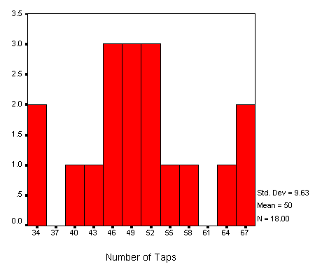
The hard work is finished when the intervals have been selected. All that remains is the counting of the frequency of scores for each interval, and, if needed, computing the relative, cumulative, and relative cumulative frequencies for the intervals. The frequency table for intervals of size three for the example data is presented below:
| Interval | Absolute Frequency |
|---|---|
| 33-35 | 2 |
| 36-38 | 0 |
| 39-41 | 1 |
| 42-44 | 1 |
| 45-47 | 3 |
| 48-50 | 3 |
| 51-53 | 3 |
| 54-56 | 1 |
| 57-59 | 1 |
| 60-62 | 0 |
| 63-65 | 1 |
| 66-68 | 2 |
The frequency histogram or polygon is drawn using the midpoints of the intervals plotted on the x-axis and the frequency on the y-axis. An absolute frequency polygon of the example data is presented below:
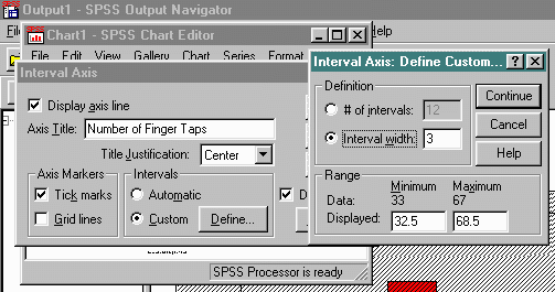
The above histogram was generated using SPSS graphic commands. The graph was first generated by selecting Graphics/Histogram commands. In order to select the appropriate interval, the resulting image was edited and the category axis was changed as follows:
All of the histograms presented in this chapter were generated in a similar manner. Selecting the appropriate interval size and real lower limit will produce the desired result.
The first interval selected might not be the interval that best expresses or illustrates the data. A larger interval will condense and simplify the data, a smaller interval will expand the data and make the picture more detailed. An alternative frequency table for the example data with an interval of 6 is presented below:
| Apparent | Real | |||||
|---|---|---|---|---|---|---|
| Interval | Lower Limit | Upper Limit | Lower Limit | Upper Limit | Midpoint | Abs. Freq. |
| 30-35 | 30 | 35 | 29.5 | 35.5 | 32.5 | 2 |
| 36-41 | 36 | 41 | 35.5 | 41.5 | 38.5 | 1 |
| 42-47 | 42 | 47 | 41.5 | 47.5 | 44.5 | 4 |
| 48-53 | 48 | 53 | 47.5 | 53.5 | 50.5 | 6 |
| 54-59 | 54 | 59 | 53.5 | 59.5 | 56.6 | 2 |
| 60-65 | 60 | 65 | 59.5 | 65.5 | 62.5 | 1 |
| 66-71 | 66 | 71 | 65.5 | 71.5 | 68.5 | 2 |
| 18 | ||||||
Note that for the first interval, the apparent lower limit is 30, the apparent upper limit is 35, the real lower limit is 29.5, the real upper limit is 35.5, and the midpoint is 32.5. The midpoint is not a unit of measurement, like 33, but a half unit, 32.5. The problem with having a midpoint that is not a unit of measurement is due to the even interval size, six in this case. For this reason, odd interval sizes are preferred.
Selection of the appropriate interval size requires that the intended audience of the graph be constantly kept in mind. If the persons reading the graph are likely to give the picture a cursory glance, then the information must be condensed by selecting a larger interval size. If detailed information is necessary, then a smaller interval size must be selected. The selection of the interval size, therefore, is a trade-off between the amount of information present in the graph, and the difficulty of reading the information.
Factors other than the interval size, such as the number of scores and the nature of the data, also affect the difficulty of the graph. Because of this, the my recommendation is to select more than one interval size, draw the associated polygon, and use the resulting graph which best expresses the data for the purposes of the given audience. In this case there are no absolutes in drawing frequency polygons.
An interactive exercise is available to explore how changes in interval size effect the frequency table, relative frequency polygon, and relative cumulative frequency polygon.
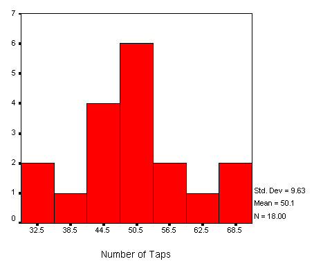
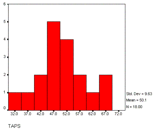
The frequency table and resulting histogram for the example data and an interval of size 5 is presented below:
| Apparent | Real | |||||
|---|---|---|---|---|---|---|
| Interval | Lower Limit | Upper Limit | Lower Limit | Upper Limit | Midpoint | Abs. Freq. |
| 30-34 | 30 | 34 | 29.5 | 34.5 | 32 | 1 |
| 35-39 | 35 | 39 | 34.5 | 39.5 | 37 | 1 |
| 40-44 | 40 | 44 | 39.5 | 44.5 | 42 | 2 |
| 45-49 | 45 | 49 | 44.5 | 49.5 | 47 | 5 |
| 50-54 | 50 | 54 | 49.5 | 54.5 | 52 | 4 |
| 55-59 | 55 | 59 | 54.5 | 59.5 | 57 | 2 |
| 60-64 | 60 | 64 | 59.5 | 64.5 | 62 | 1 |
| 65-69 | 65 | 69 | 64.5 | 69.5 | 67 | 2 |
| 18 | ||||||
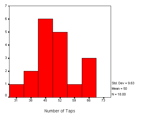
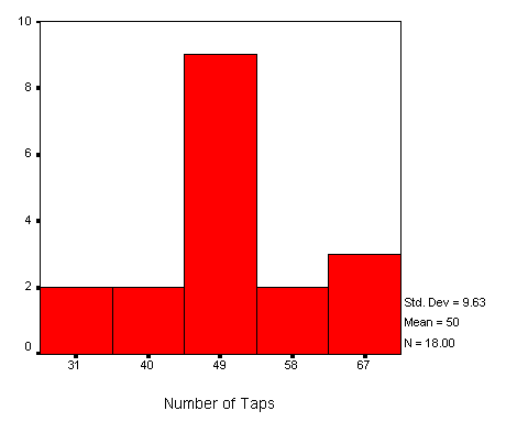
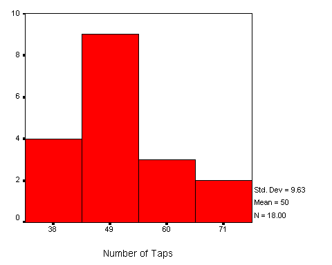
In a like manner, the histograms for intervals of 7, 9, and 11 are now presented.
As can be seen, the shape of the distribution changes as different interval sizes are selected. In some cases, the distribution appears almost symmetric, while in others, the distribution appears much less symmetric.